TL;DR:
- Colour influences up to 90% of first impressions and significantly boosts brand recognition.
- A structured four-step process—auditing competitors, audience testing, cultural checks, and material testing—ensures effective colour choices.
Colour determines first impressions, recognisability, and perceived value for branded merchandise, often before a single word is read. Research consistently shows that up to 90% of a consumer’s first impression is based on colour alone, and that consistent colour use can boost brand recognition by as much as 80%. For procurement teams, that means colour decisions deserve the same rigour as material selection or print method.
Three actions to take right now:
- Audit your competitors’ colour territories before locking in a palette
- Align your colour energy to your specific audience and product category
- Request Pantone (PMS) references and physical samples, not just digital mock-ups
Procurement quick-start checklist:
- Confirm HEX, RGB, CMYK, and PMS codes with your design team before briefing suppliers
- Request a two-stage approval: digital proof first, physical sample second
- Document acceptable colour tolerance (Delta-E or visual match standard) in your purchase order
Table of Contents
- Why colour shapes the business outcomes of branded merchandise
- A four-step framework for choosing colour on promo products
- How colour behaves across different materials and print methods
- When to adapt colour and when to stay consistent
- Procurement checklist for colour: specs, proofing and timelines
- How to build colour rules into your brand guidelines
- How Chilli Promotions applies this approach
- Key takeaways
- Why strict colour processes matter more than most buyers expect
- Colour-matched merchandise, done right with Chilli Promotions
- Useful sources
- FAQ
Why colour shapes the business outcomes of branded merchandise
Colour is the first signal your branded product sends, and it works faster than any headline. Studies show consumers form an impression within 90 seconds, with 62–90% of that assessment driven by colour alone. For a promotional product, that window is everything.
The business outcomes colour influences fall into four clear categories:
- Recognition: consistent palette use across merchandise, uniforms, and giveaways trains audiences to identify your brand at a glance, even in a crowded trade show hall
- Perceived value: premium finishes in deep, consistent tones read as higher quality; washed-out or mismatched colours undermine that perception immediately
- Visibility: bold, consistent palettes improve on-site recognition at events, retail environments, and university orientation weeks
- Emotional cueing: colour primes the emotional state a recipient brings to your product, whether that is trust, energy, calm, or excitement
Consider a university orientation giveaway: a tote bag in the institution’s exact navy and gold signals belonging and pride. The same bag in a generic royal blue feels like an afterthought. At a tech trade show, a charcoal and electric-blue power bank reads as credible and current; the same product in pastel yellow does not. Colour choices in advertising and merchandise are, in effect, silent brand ambassadors.
Statistic: Colour can influence up to 90% of customer buying decisions, making it one of the highest-leverage variables in any promotional product brief.
A four-step framework for choosing colour on promo products
Use this structured process to move colour selection beyond personal taste and into a testable, defensible decision. Australian brand strategists recommend exactly this four-step approach.
Step 1: Competitive audit
Map the dominant colours in your category and identify crowded territories. Document:
- The primary and secondary colours used by your three closest competitors
- Any colour that is so strongly owned by one player that using it would cause confusion
- Gaps in the palette landscape your brand could occupy
Step 2: Audience alignment
Colour resonates differently across demographics, industries, and product categories. Category-specific testing consistently outperforms generic colour rules. Consult your marketing team and, where budget allows, run a micro-survey or staff wear trial before committing to a bulk run.
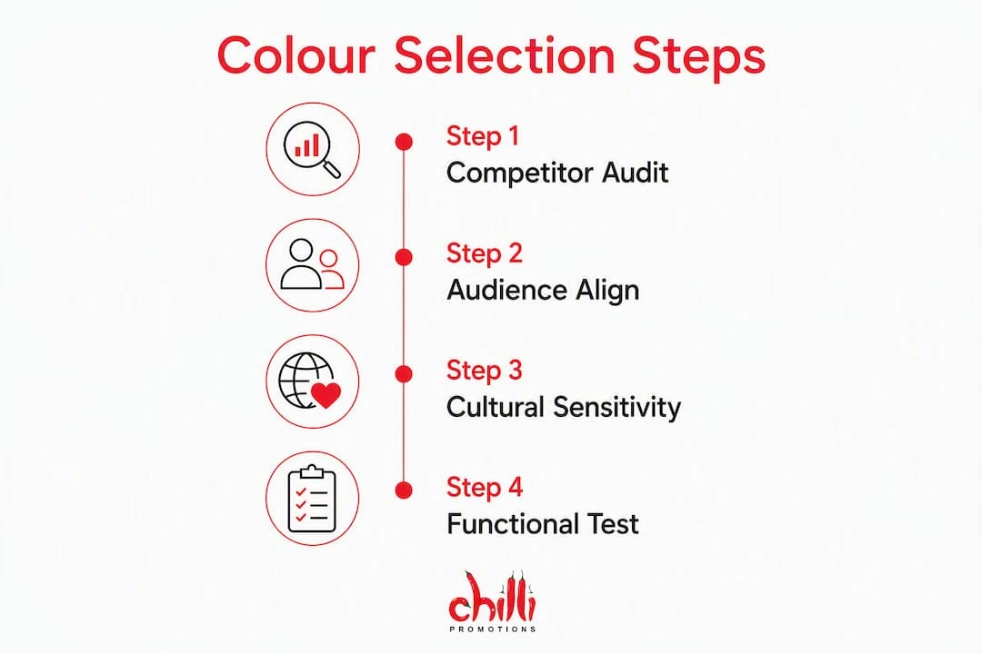
Step 3: Cultural sensitivity
Colour meanings shift significantly across cultures. White signals purity in Western markets but mourning in parts of Asia; light blue carries death associations in some South-East Asian regions. If your merchandise will be distributed across a diverse workforce or exported, brief your regional leads and check cultural connotations before sign-off.
Step 4: Functional testing
A colour that looks striking on a screen can disappear on a matte plastic surface or bleed on woven fabric. Merchandise colour schemas differ by product family, so test each category separately. Request a small-batch A/B run on your two strongest candidates before committing to full production.
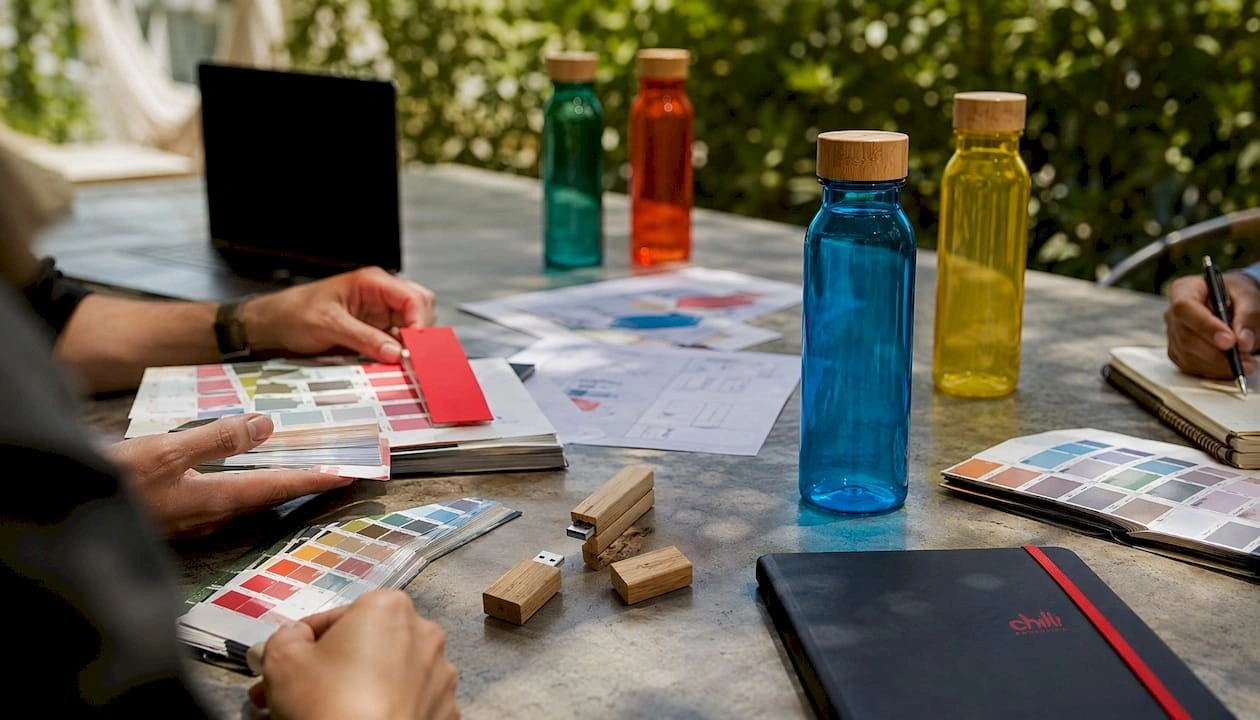
Pro Tip: For a tech accessory, run a side-by-side physical comparison of your top two colour options on the actual substrate. For a conference giveaway like a notebook or tote, prioritise legibility of your logo over background colour impact.
How colour behaves across different materials and print methods
Identical colour codes rarely look identical across materials. A PMS 286 blue will appear richer on a gloss-coated metal drink bottle than on a woven cotton tote, where the thread structure diffuses the hue. Plan for variation from the start.
| Material / finish | Typical colour behaviour |
|---|---|
| Gloss metal (drinkware) | Colours appear vivid and saturated; fine detail reproduces well |
| Matte plastic (tech accessories) | Colours read slightly flatter; dark tones can look grey-shifted |
| Woven fabric (bags, apparel) | Thread limits solid fills; gradients and fine lines are not achievable |
| Embroidery (apparel, caps) | Colour range is restricted to thread stock; subtle tones are lost |
| Uncoated paper / card (stationery) | Colours absorb into stock and appear less saturated than on-screen |
Print method implications:
- Screen print: excellent for solid fills and spot colours; not suited to photographic gradients
- Pad print: precise for small areas on curved surfaces; colour count is typically limited to 4–6 per run
- Dye sublimation: full-colour photographic quality on polyester substrates; colours shift on natural fibres
- Embroidery: thread palette is finite; request a physical thread card, not a digital colour match
Legibility checklist:
- Test your logo at the smallest size it will appear on the product
- Confirm contrast ratio between logo colour and product colour meets accessibility standards
- Colour vision deficiency affects a meaningful share of your audience; avoid red-on-green or blue-on-purple combinations
Pro Tip: Always request a Pantone physical proof and a production-matched swatch before approving bulk. Digital mock-ups cannot replicate how a finish absorbs or reflects light.
When to adapt colour and when to stay consistent
Default to palette consistency. Adapt colour only when a campaign goal or seasonal moment genuinely justifies the cost and inventory risk.
Decision points to weigh before changing colour:
- Will the seasonal variant be reusable next year, or is it single-use?
- Does the colour change serve a clear audience expectation (graduation gold, Christmas red) or is it purely decorative?
- Can you manage separate inventory without creating excess stock?
- Is the variant distinct enough to feel intentional, or will it read as a production error?
Seasonal examples where adaptation earns its keep: graduation merchandise in institutional colours, end-of-financial-year corporate gifts in a premium accent tone, and university orientation packs where faculty colours differentiate colleges. In each case, the colour shift carries meaning for the recipient.
Pro Tip: For seasonal runs, order conservatively and build in a reorder window. Overcommitting to a limited-edition colour is one of the fastest ways to dilute brand consistency and tie up budget in slow-moving stock.
Procurement checklist for colour: specs, proofing and timelines
Ask for Pantone references, fabric swatches, print method confirmations, and a two-stage approval process in every RFQ. This is the single step that prevents the most common and costly colour surprises.
Colour specification checklist for supplier briefs:
- Provide colour in all four formats: HEX, RGB, CMYK, and PMS
- State the substrate and finish (e.g. gloss metal, matte ABS plastic, 300gsm uncoated card)
- Specify the print method and maximum colour count
- Request a digital proof for layout approval, then a physical production sample for colour approval
- Document acceptable tolerance in writing (e.g. “within Delta-E 2.0 of PMS reference”)
- Confirm who holds sign-off authority and record their approval with a date stamp
Typical Australian lead times:
| Stage | Typical timeframe |
|---|---|
| Digital proof | 2–5 business days |
| Physical sample / pre-production proof | 7–14 business days |
| Bulk production (standard) | 10–20 business days post-approval |
| Reorder (same spec) | 7 business days |
| Rush production (if available) | Add up to 50% cost premium |
Cost drivers to budget for:
- Custom dye runs for exact PMS matches on fabric or silicone
- Special finishes (soft-touch coating, metallic ink, spot UV) add per-unit cost
- Small-batch premiums apply below minimum order quantities
- Rush charges and expedited freight can double landed cost on tight timelines
Refer to the promotional product checklist for a full supplier brief template.
How to build colour rules into your brand guidelines
A production-ready colour section combines palette rules, usage ratios, and material-specific notes. Without those three elements, suppliers will interpret your brief differently every time.
Brand palette template:
- Primary colour (60%): dominant brand colour used on the majority of product surface area
- Secondary colour (30%): supporting tone used for contrast, backgrounds, or secondary elements
- Accent colour (10%): high-impact tone reserved for calls to action, highlights, and seasonal variants
Common misuse examples to document as “do nots”:
- Logo reversed out of a colour with insufficient contrast
- Brand colour reproduced as a tint (e.g. 50% opacity) without explicit approval
- Secondary colour used at primary proportion, inverting the intended hierarchy
- Embroidery thread substituted for a “close enough” match without approval
Governance checklist:
- Assign a single version-controlled brand guidelines document with a clear owner
- Record PMS, CMYK, RGB, and HEX values in the same document
- List approved material-specific notes (e.g. “on embroidery, substitute PMS 286 with thread ref Madeira 1082”)
- Set a review cycle and document who can approve new colour variants
Consistent colour application over time builds brand equity; inconsistent palettes dilute recognition and erode the investment made in every previous order.
How Chilli Promotions applies this approach
Founded in 2001, Chilli Promotions has been manufacturing and supplying branded promotional products across Australia and New Zealand for over two decades. That experience translates directly into how colour decisions are managed for clients across sectors.
Sector examples:
- IT and tech accessories: conservative palettes (charcoal, slate, black) with a single accent colour tend to perform well for credibility-driven audiences; Chilli Promotions’ IT sector product range is briefed with this in mind
- Universities: faculty-specific colour runs require tight PMS matching and clear governance to avoid cross-faculty confusion; orientation week timelines demand early sample sign-off
- Corporate gifts: premium finishes in deep, consistent tones reinforce perceived value; eco-friendly product lines introduce an additional consideration, as recycled and plant-based materials carry a narrower available colour range
Client process from brief to delivery:
- Colour brief and PMS specification confirmed with client
- Digital proof issued for layout and colour review
- Physical pre-production sample dispatched for substrate approval
- Client sign-off recorded before bulk production commences
- QC check against approved sample before despatch
Sustainability note: Eco materials, including recycled PET, bamboo, and plant-based substrates, often have a more limited dye range than conventional materials. Chilli Promotions flags this at briefing stage so clients can adjust their palette expectations before production, not after.
Pro Tip: Request your physical sample at least three weeks before your event date. That buffer allows for a reprint if the colour match falls outside tolerance, without incurring rush charges.
Key takeaways
Colour drives recognition, perceived value, and emotional cueing for branded merchandise, and the four-step framework (competitive audit, audience alignment, cultural sensitivity, functional testing) is the most reliable way to make that work in practice.
| Point | Details |
|---|---|
| Colour drives first impressions | Up to 90% of a consumer’s first impression is based on colour alone. |
| Use the four-step framework | Audit competitors, align to audience, check cultural meanings, then test on the actual substrate. |
| Material changes colour appearance | The same PMS code reads differently on gloss metal, matte plastic, woven fabric, and embroidery thread. |
| Lock specs before production | Provide HEX, RGB, CMYK, and PMS codes; require a physical sample before bulk sign-off. |
| Chilli Promotions | Offers Pantone matching, physical pre-production proofs, and sector-tailored runs across Australia and New Zealand. |
Why strict colour processes matter more than most buyers expect
The gap between a colour on screen and a colour on a finished product is wider than most procurement teams anticipate, and the consequences of getting it wrong arrive in a box of 500 units. Colour management is not a design nicety; it is a production discipline.
What tends to get underestimated is how much the substrate does to a colour. A matte soft-touch coating will absorb light and shift a vivid blue toward grey. An embroidered logo in a “matching” thread will read as a different hue entirely under fluorescent event lighting. These are not supplier errors; they are physics. The only reliable defence is a physical proof on the actual production material, approved by someone who has seen the brand in the real world.
Chilli Promotions’ commitment to two-stage approvals, physical swatches, and transparent production timelines exists precisely because these surprises are preventable. Clear specs, early samples, and honest communication about material constraints are what separate a successful colour outcome from an expensive reorder.
Colour-matched merchandise, done right with Chilli Promotions
Getting colour right on branded merchandise takes more than a good brief. It takes a supplier who understands how colour behaves across substrates, print methods, and eco materials, and who builds physical proofing into the process as standard.
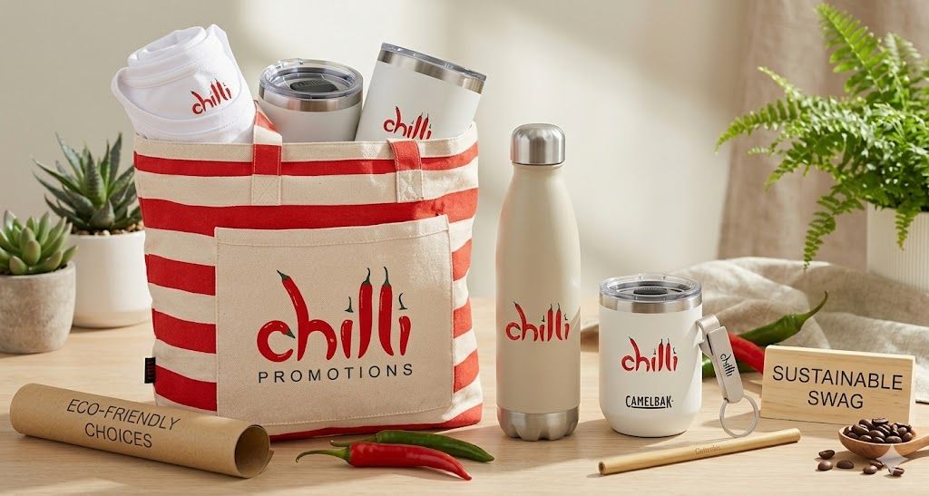
Chilli Promotions offers Pantone matching, pre-production physical proofs, and sector-specific runs for Australian and New Zealand buyers, from IT tech accessories and university orientation packs to corporate giveaways and sustainable product lines. Whether you need a small-batch A/B colour test or a full branded merchandise programme, the process starts with a clear colour brief and ends with a sample you have physically approved.
Browse the full promotional products range or get in touch to request a Pantone-matched sample run. Typical sample turnaround is 7–14 business days.
Useful sources
Key references used in this guide, recommended for procurement and design teams seeking deeper reading:
- TDS Australia: Colour Psychology and Brand Design — practical Australian agency guidance on colour frameworks, PMS matching, and first-impression statistics; useful for briefing internal stakeholders
- University of Sydney: Colour and Product Context (Honours Thesis) — academic evidence that colour psychology must be tested in product context, not applied generically; supports the four-step framework
- Think Creative Agency: The Power of Colour in Branding — covers seasonal relevance, contrast strategy, and accessibility; useful for campaign planning
- Wise Web: Colour Psychology in Branding — Australian-market commentary on palette consistency and event visibility
- Chilli Promotions: Promotional Product Checklist — practical supplier brief template for Australian buyers
- Chilli Promotions: Sustainable Promotional Products Guide — detail on eco material colour constraints and carbon-offset options
This article provides general guidance on colour strategy for branded merchandise. For cultural sensitivity checks and legal compliance in specific markets, consult your regional leads and relevant professional advisers.
FAQ
What role does colour play in branded promotional products?
Colour drives recognition, perceived value, and emotional response, often before a recipient reads any text. Studies show consumers form an impression within 90 seconds, with 62–90% of that assessment based on colour, making it one of the highest-leverage decisions in a promotional merchandise brief.
Why does the same colour look different on different products?
Substrate and finish change how colour is perceived. A gloss metal surface reflects light and intensifies hue; matte plastic absorbs it and flattens tone; woven fabric diffuses solid fills through thread structure. Pantone matching and physical proofs are the only reliable way to confirm colour before bulk production.
How do I choose the right colour for my branded merchandise?
Follow the four-step framework: audit competitor colour territories, align your palette to your specific audience and product category, check cultural connotations for your distribution markets, then test on the actual substrate with a physical sample. Chilli Promotions supports each of these steps as part of its standard briefing process.
When should I adapt colour for seasonal campaigns?
Adapt colour when the change carries clear meaning for the recipient, such as graduation merchandise in institutional colours or Christmas gifts in a premium accent tone, and when you can manage inventory without overcommitting. Default to consistency; seasonal variants should feel intentional, not incidental.
What colour specifications should I provide to a supplier?
Provide your colour in all four formats: HEX, RGB, CMYK, and PMS. State the substrate, finish, and print method, and require a digital proof followed by a physical production sample before approving bulk. Document sign-off authority and acceptable colour tolerance in writing.