The single rule that governs every logo placement decision: size and position change with the surface, but the anchor points don’t. A left chest logo sits 3 to 4 inches wide, measured 4 inches down from the shoulder seam and 4 inches in from the armhole, on every polo, jacket or tee you produce, according to Arklavo’s placement research. Full front and back marks scale up. Digital and print pieces work on percentages, not inches.
Here’s the quick map before we get into copy-ready numbers:
- Left chest: 3 to 4 in wide, anchored off the shoulder seam and armhole
- Centre chest / full front: 8 to 12 in wide, positioned below the collar
- Full back: 10 to 14 in wide, 6 to 8 in below the collar
- Sleeve: 1 to 2 in below the shoulder seam
- Hat front panel: limited by panel curvature, not flat-garment rules
- Bag panel / drinkware: placement follows the dieline, not the geometric centre
- Social images and posters: corner or focal-point placement at 5 to 10% of image width
Printing method changes every one of those numbers. Embroidery, screen print and DTG each have their own minimums, covered further down. Chilli Promotions, a manufacturer and supplier of branded merchandise across Australia and New Zealand since 2001, uses these exact anchor points on production floors daily, and the measurement anchors themselves (shoulder seam, collar seam, armhole) are the industry-standard reference system you should insist on with any supplier.
Key Takeaways
Consistent logo placement across every product and platform comes down to fixed measurement anchors, method-aware sizing, and a dieline check before any curved or seamed item goes to production.
| Point | Details |
|---|---|
| Anchor every apparel placement | Use shoulder seam, collar seam and armhole as fixed reference points on every garment order. |
| Match size to decoration method | Embroidery needs roughly 2 in minimum detail size; screen print and DTG have their own margins. |
| Apply the clear space rule | Keep a buffer equal to the height of your logo’s tallest letter or symbol on every side. |
| Request dielines for curved items | Bags, drinkware and caps need a supplier dieline before art approval to avoid distortion. |
| Work with a practitioner supplier | Chilli Promotions applies these exact anchor points and dieline checks across its Australian and New Zealand production runs. |
Table of Contents
- Logo placement guidelines: zones and measurement rules
- What clear space and minimum size rules should a logo follow?
- Apparel and merchandise: where exactly does the logo go?
- How do printing and decoration methods affect placement?
- Setting placement rules for co-branded and sponsor logos
- Do’s, don’ts and a production-ready checklist
- Chilli Promotions’ practical templates and supplier notes
- Accessibility considerations for logo visibility and placement
- Cultural and regional considerations affecting logo placement
- Digital platform logo placement: what changes on screens?
- How Chilli Promotions can put these specs into production
- Author perspective: why precise placement protects brand equity
- FAQ
Logo placement guidelines: zones and measurement rules
Every garment and product category has a “default” zone that decoration teams reach for first, and the smart move is treating that default as a rule, not a suggestion. Deviating from it without a good reason usually means a re-proof.
Left chest stays the workhorse placement for polos, jackets and button shirts. Keep the logo at 3 to 4 inches wide, anchored 4 inches below the shoulder seam and 4 inches in from the armhole, as Arklavo’s sizing guide sets out. For youth sizing, scale the whole mark down to roughly 70% of the adult dimensions rather than guessing a smaller number, a scaling rule confirmed in Designhill’s placement breakdown.
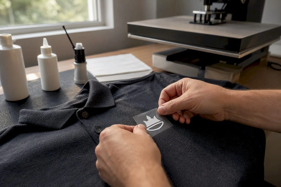
Centre chest and full front placements run bigger, typically 8 to 12 inches wide, and full-front merchandise designed to be the hero graphic often stretches to 11 or 12 inches. Position the top of the mark a consistent distance below the collar seam so it doesn’t creep toward the neckline on different body types.
Full back placements are the biggest standard zone: 10 to 14 inches wide, centred 6 to 8 inches below the collar. This is the go-to for event staff shirts and team uniforms where visibility from a distance matters more than subtlety.
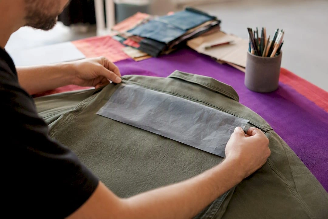
Sleeve logos sit small and high, usually 1 to 2 inches below the shoulder seam, and rarely exceed 3 inches wide before they start wrapping awkwardly around the arm.
Hat fronts, bag panels and drinkware don’t follow flat-garment math at all. Panel curvature and stitching limits dictate the ceiling on size, which is why suppliers ask for a dieline before finalising art on any of these.
| Placement zone | Recommended size | Anchor point |
|---|---|---|
| Left chest | 3–4 in wide | 4 in below shoulder seam, 4 in from armhole |
| Centre chest / full front | 8–12 in wide | Fixed distance below collar seam |
| Full back | 10–14 in wide | 6–8 in below collar |
| Sleeve | Up to 3 in wide | 1–2 in below shoulder seam |
| Hat front panel | Panel-limited | Set by supplier dieline |
| Bag panel / drinkware | Panel-limited | Set by supplier dieline |
Use Lead Apparel’s anchor-point guidance as your baseline brief language when you’re writing specs for a new supplier. Reference the shoulder seam, collar seam and armhole by name and you’ll cut down on the “where exactly?” emails.
What clear space and minimum size rules should a logo follow?
Clear space protects legibility more than any single sizing rule, and it’s calculated the same way regardless of medium: X equals the height of the tallest letter or symbol in your logo, and no other element sits within that distance on any side. If your wordmark’s cap height is 20mm, keep a 20mm buffer all the way around it, whether that’s on a business card, a banner or a tote bag.
Minimum reproduction sizes vary sharply by decoration method:
- Embroidery: fine detail and thin type breaks disappear below roughly 2 inches
- Screen print: holds detail down to smaller sizes than embroidery but registration drifts on tiny multi-colour art
- Digital / on-screen: a logo mark should stay legible at 24px or smaller for favicon-style use
- Documents and letterheads: keep the mark no smaller than 0.5 inches wide to survive printing and scanning
Pro Tip: Print your logo at the smallest size you’re planning to use, then hold it at arm’s length. If you squint to read it, so will your customer.
Contrast matters as much as size. A full-colour logo on a dark polo or a busy background needs a reversed or icon-only variant on standby, not a forced fit. Frontify’s guidelines framework recommends building these alternate variants into your brand file from the start, rather than improvising them mid-production when a supplier flags a legibility issue.
Apparel and merchandise: where exactly does the logo go?
Garment category dictates both placement and decoration limits, and the two decisions aren’t separable. Here’s how to brief each one.
- Polos and jackets: left chest at 3 to 4 inches wide, embroidered. Embroidery holds up over hundreds of wash cycles, but fine linework and thin serif fonts blur out below about 2 inches, a limitation Designhill’s decoration guide flags as the most common embroidery complaint from first-time brand managers.
- T-shirts and hoodies: centre chest for a standalone statement piece, or scaled down to left chest for a more corporate look. Hoodies need extra care around the front pocket seam and hood pocket opening, both of which can swallow part of a logo if you don’t account for them in the mock-up.
- Full back and yoke marks: reserved for event staff, volunteer teams and uniformed crews where the goal is “readable from across a room.” Yoke placement (the small triangle at the top back of a shirt) works for a secondary mark or sponsor logo, not your primary brand.
- Hats: the front panel caps both width and height independently of flat-garment rules, and side panels suit a smaller secondary mark or a date/event tag. Embroidery on caps has a tighter size ceiling than on a polo because the panel itself is small and curved.
- Bags and drinkware: panel selection matters more than sizing here. A tote’s front panel behaves like a flat garment, but drinkware curves, and the visual centre a customer sees when they pick up a bottle isn’t the geometric centre of the artwork file. Always request a dieline and a physical sample proof before you approve a print run on anything cylindrical.
Chilli Promotions builds this dieline check into every new drinkware or bag order, because a mark that looks centred on screen can sit visibly off when wrapped around a curved surface. For a broader look at what’s available across categories, our guide to custom branded apparel covers placement-friendly product types in more depth.
How do printing and decoration methods affect placement?
Decoration method sets the floor on how small or detailed your logo can go, and getting this backwards, choosing the art before the method, is the single biggest cause of a rejected first proof.
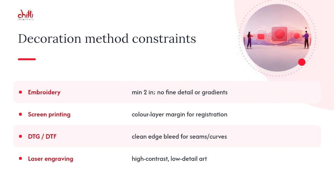
Embroidery suits polos, jackets and caps and holds up to heavy wear better than any other method, but it can’t reproduce fine detail below roughly 2 inches and struggles with gradients. Keep left-chest embroidered marks simple: bold shapes, limited colours, no thin outlines.
Screen printing is the standard for bulk t-shirt runs and handles bold, large-area graphics well, but multi-colour designs need registration tolerance, extra margin around each colour layer so slight misalignment during printing doesn’t blur the edges. Designhill’s guide notes screen print stays the lowest-cost option at volume, which is exactly why it dominates event merchandise.
DTG and DTF printing handle fine detail and full colour better than screen print on small runs, but need clean edge bleed margins to avoid a cut-off look on curved or seamed placements like hoodie pockets.
Laser engraving, used on metal drinkware and tech accessories, needs high-contrast, low-detail art. Fine type and thin lines that read fine on paper often vanish once engraved.
Pro Tip: Before committing to a full production run on a new product line, request a physical sample proof, not just a digital mock-up. Screen colours and fabric colours rarely match exactly, and a photo can’t show you engraving depth or embroidery stitch density.
Setting placement rules for co-branded and sponsor logos
Multi-brand layouts fail for one reason more than any other: nobody decided in advance whose mark comes first. Fix that before you touch sizing.
- Establish hierarchy first. The primary brand’s logo sits larger and typically first, left-to-right or top-to-bottom. Secondary and sponsor marks scale down proportionally, never larger than the primary mark, even if the sponsor insists.
- Set a sponsor row rule. When multiple sponsor logos sit in a row, give every mark equal clear space, align them to a shared baseline, and cap the maximum height so no single logo dominates through sheer scale.
- Fix colour and contrast issues before print. A sponsor’s full-colour mark on your brand’s dark background usually needs a mono or reversed variant. Request that variant from the partner rather than forcing their standard file to work.
- Build a one-page approval checklist covering hierarchy, sizing, clear space and colour, and get sign-off from every brand involved before the file goes to production.
Getting this wrong doesn’t just look messy, it reads as a hierarchy dispute to anyone looking at the final product.
Do’s, don’ts and a production-ready checklist
Most placement errors trace back to a handful of repeatable mistakes, and most of them are avoidable with a five-minute brief.
Do:
- Supply vector files (AI, EPS or SVG), never a low-res JPEG pulled from a website
- Define anchor points explicitly (shoulder seam, collar, armhole) in every spec you send
- Use pre-approved logo variants only, never a resized or recoloured version made on the fly
- Request a dieline for anything curved or seamed before approving art
Don’t:
- Place a logo across a seam, pocket opening or zipper line
- Approve artwork based on a screen mock-up alone for a new product category
- Mix placement zones inconsistently across a product family (left chest on polos, centre chest on the matching tee)
- Skip a physical proof on the first run of any new item
Copy this checklist straight into your next production brief:
- Vector artwork attached (AI/EPS/SVG)
- Placement coordinates and anchor points specified
- Colour specs confirmed (Pantone or CMYK)
- Decoration method matched to logo detail level
- Dieline requested for curved/seamed items
- Physical proof approved before full run
Escalate before production if any of the following show up: pixelated source art, no anchor point specified, a colour mismatch between brand guide and supplier proof, or a request to place a logo across a functional seam.
Chilli Promotions’ practical templates and supplier notes
Chilli Promotions has manufactured and supplied branded merchandise across Australia and New Zealand since 2001, and the specs below are the ones our production team asks for on every new order.
Dieline request checklist to send a supplier:
- Product name, colour and material
- Decoration method requested
- Vector logo file plus Pantone/CMYK reference
- Placement coordinates against a named anchor (seam, panel edge, base)
Two copy-ready specs:
- Left chest, polo: 3.5 in wide, 4 in below shoulder seam, 4 in from armhole
- Full back, event tee: 12 in wide, 7 in below collar seam
Pro Tip: Ask any new supplier to send a dieline before art approval, not after. It’s the single fastest way to catch a curvature or seam problem before it’s printed on 200 units.
For a wider view of how consistent placement protects your brand across an entire merchandise range, our practical guide to brand consistency covers file management and approval workflows in more depth.
Accessibility considerations for logo visibility and placement
Legibility isn’t only about print quality, it’s about who can actually see and read the mark. Colour contrast is the first checkpoint: a logo that relies on subtle tonal differences (navy on black, pale grey on white) fails for people with low vision or colour vision deficiency well before it fails on a screen colour test. Build a high-contrast variant into your brand file for exactly this reason, not as an afterthought.
Placement height matters too, especially on signage, uniforms and trade show materials viewed at a distance or from a wheelchair-height sightline. A logo placed too high on a banner or too small on a name badge disadvantages readers who can’t easily tilt or approach to read it.
For digital use, always pair a logo image with descriptive alt text, since screen readers can’t interpret a graphic on their own. Keep that alt text simple: the brand name is usually enough, rather than a literal description of the mark’s shape or colour.
On physical products, avoid placing a logo somewhere it will be obscured by normal use, a strap, a handle, or a fold line, because that’s an accessibility issue as much as a design one: if a logo can’t be seen in its intended context, it isn’t doing its job for anyone, disability or not.
Cultural and regional considerations affecting logo placement
Placement conventions that feel neutral in one market can read differently elsewhere, and it’s worth checking before you roll a design out across regions. Colour association is the most common trip-up: colours that signal celebration in one culture can signal mourning or caution in another, which matters when you’re choosing a background for a logo lock-up on region-specific merchandise.
Text direction affects layout too. A logo paired with a tagline designed for left-to-right reading needs a mirrored or adapted layout for right-to-left markets, otherwise the visual hierarchy reads backwards.
Modesty and symbolism norms can affect placement choice on apparel specifically. Full-front, large-scale branding that’s standard for a Western event tee might be considered too prominent for some workwear contexts in other regions, where a smaller left-chest mark is the safer default.
For any business producing merchandise for a genuinely multi-market audience, the safest approach is a base logo lock-up with pre-approved regional variants, sized and coloured for local norms, rather than a single global file forced onto every market. It costs a little more planning upfront and avoids a costly reprint later.
Digital platform logo placement: what changes on screens?
Every digital platform has its own safe zone, and the rules that work for print don’t transfer directly. Social media profile images are typically cropped to a circle or square, so any logo with detail near the edges gets clipped, keep the mark centred with generous padding inside the crop boundary.
For in-feed graphics, Barnimages’ social placement guide recommends a consistent corner (bottom-right or top-left, picked once and never swapped) sized at roughly 5 to 10% of the image width. Consistency here builds recognition faster than a redesign ever will.
Responsive web design adds another layer: a logo that looks right in a desktop header often needs a simplified version, icon-only or without a tagline, once the layout collapses to mobile width. Build that fallback into your design system rather than letting a developer shrink the full lock-up and hope it still reads at 120 pixels wide.
Video overlays need a defined safe zone that avoids platform UI elements (comment icons, captions, the scrub bar), and a watermark-style logo should sit at reduced opacity, enough to be visible, not enough to distract from the content itself. Documents and email signatures are the simplest case: use a high-resolution PNG or SVG, and keep the logo height in a signature under roughly 60 pixels so it doesn’t overwhelm the contact details beneath it.
How Chilli Promotions can put these specs into production
Every measurement in this guide is production-ready the moment you hand it to us: Chilli Promotions manufactures and supplies branded merchandise across Australia and New Zealand and can take your left-chest offsets or full-back coordinates straight to a proof, no translation layer needed between your brand guide and the factory floor.
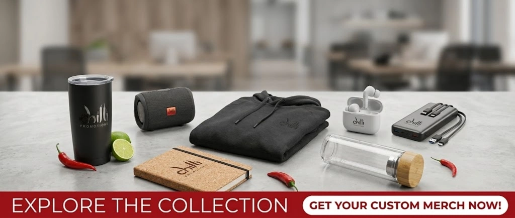
We’ll send a dieline for anything curved or seamed before art goes to print, so distortion gets caught at the proof stage, not after 300 units land on your loading dock. If sustainability is part of your brief, ask about our carbon-offset and eco-friendly product lines when you request a sample. Browse our range of corporate giveaway options and get a quote with your exact placement specs attached, we’ll turn it into a proof you can approve in one round, not five.
Author perspective: why precise placement protects brand equity
Sloppy placement is the fastest way to make a professional brand look amateur, and it costs nothing to avoid. The businesses that treat anchor points and clear space as fixed rules, not creative suggestions, are the ones whose merchandise still looks sharp three product ranges later.
FAQ
Where should a logo be positioned on a garment?
Left chest is the standard default at 3 to 4 inches wide, anchored 4 inches below the shoulder seam and 4 inches from the armhole, with centre chest and full back reserved for larger, more visible statements.
What are the most important rules for good logo placement?
Fix a measurement anchor (shoulder seam, collar, or a percentage of image width for digital), maintain clear space equal to the logo’s tallest element, and match the size to your decoration method before finalising artwork.
Where should a logo go on a document?
Keep it in a consistent corner, usually top-left or top-right, sized around 0.5 to 1 inch wide, with enough surrounding white space that it doesn’t crowd headings or body text.
What should you avoid when placing a logo on documents or merchandise?
Avoid placing it across a seam or fold, using low-resolution source files, ignoring minimum size limits for the decoration method, and applying inconsistent placement across a product family.
Does the printing method really change where a logo should sit?
Yes. Embroidery, screen print, DTG and laser engraving each have different minimum detail sizes and edge tolerances, which is why Chilli Promotions requests a dieline and physical proof before finalising placement on any new product.