A History of the Olympic Rings: Not Just a Logo
The Olympic rings are instantly recognisable the world over, igniting a love of the Games and underpinning millions of ambitions and experiences.
The iconic logo design encapsulates two meanings: the original significance, and the assigned meaning.
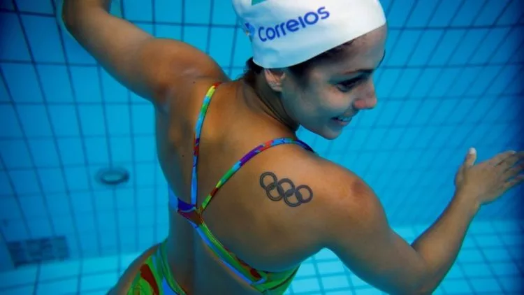
The symbol, first designed by Baron de Coubertin (founder of the Olympic Committee), was conceived of as a symbol of union adopting colours which all competing nation’s flags were comprised of – blue, black, red, green, and yellow. The rings themselves were to represent community, and their interlocking nature evidence of the global coming-together facilitated by the athletic events. Such is the ‘original meaning’.
The second meaning, or the assigned meaning, is that which has developed throughout your life; what has spawned from personal experiences and emotional attachments made.
You see, the 5 interlocking rings once only represented a single occasion. Now though, the rings embody a multiplicity of meanings and interpretations, an anchor to which millions of emotions and attachments are pinned. That’s what a good logo becomes.
A logo starts out as an image that reflects your ambitions of growth of your Start-Up, or your responsibility to whom you owe that new job, or maybe the weight of your dream career opportunity now before you. But soon, through hard work and upbuilding stakeholder interactions, your logo’s meaning becomes multiplied, its value and its power communicated on every product bearing it.
Want advice on memorable branded merchandise that leaves an ever-lasting mark?
For more information please contact Chilli Promotions
Call us on ✆ 1300 913 288
☛visit: https://www.chillipromotions.com.au
#promotionalproducts